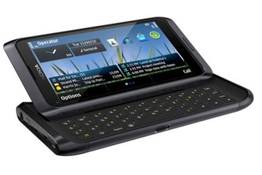
Nokia's last gasp Symbian smartphone, the E7, is here. Does it go out in a blaze of glory or is it a damp squib? Julian Prokaza finds out in our review.
Nokia has been having a bit of a hard time of late. The Finnish mobile phone giant recently ditched the ailing Symbian as its mobile operating system of choice (in favour of Windows Phone 7) and then announced 7,000 job losses in April as part of a €1 billion cost-cutting measure. So, with the future of both the company and Symbian still uncertain, now might not seem like an ideal time to invest in a new Symbian smartphone from Nokia, which is unfortunate, as that’s just what the E7 is.
To Nokia’s credit, the E7 is an extremely stylish smartphone. It has a sleek, all-aluminium shell with rounded edges and neatly capped-off ends, along with a 4in screen that fills the entire front of the handset. It sits nicely in the hand too, although the finish does make it rather slippy. At 176g, it isn’t too heavy to tote around in a jacket pocket.
All-screen it may be, but the E7 also packs a physical Qwerty keyboard — although it takes a short while to figure where this lurks. As with similar smartphones from other manufacturers, the keyboard is actually hidden beneath the screen, but the two halves of the case fit together so snugly that it isn’t immediately obvious how to get at it.
Flipping up the E7's screen to reveal the keyboard is a Herculean task.
Unfortunately, even when armed with the requisite knowledge, getting the case to open still isn’t easy. The E7’s smooth, rounded edges don’t give much purchase for a finger and it takes two hands — and two thumbs — to push the screen out of the way. With a firm shove though, the screen slides up (in landscape orientation) to sit at a 30-degree tilt that’s ideal for use while typing.
Sadly, the physical Qwerty keyboard itself isn’t so good. The keys are a reasonable size, but they’re very shallow and not particularly tactile. The keyboard’s width (it stretches across almost the whole case) also means two-thumb typing involves a lot of reaching back and forth, although we suspect this is a matter of personal preference rather than some kind of inherent design flaw.
Keyboard side, the Nokia E7 has a flush-fitting button on its top edge that provides the usual Symbian options for powering off and switching profiles, plus a metallic slider on the left for quickly locking and unlocking the screen. There’s a similar slider on the right for the volume control, plus a button that activates digital camera mode and then works as a shutter release. Lastly, a wide button below the screen returns the Symbian Home screen when pressed in any application, and brings up a list of installed apps when pressed at the Home screen itself.
The image quality of photos taken with camera is best described as average. The eight-megapixel photos look little better than those from lower resolution smartphone cameras.
The 4in AMOLED screen on the E7 looks great. It’s bright and vibrant, but the 640 x 360 pixel resolution seems a little meagre with 800 x 480 displays now commonplace, even if it still renders text relatively crisply. The capacitive glass screen feels fine under the finger, but the super-snappy response that’s a trademark of iOS and (to a lesser degree) Android is absent — and that’s where the E7’s problems really lie.
The shortcomings of Symbian for modern smartphone use are well known, of course – that’s why Nokia has decided to dump it, after all. The version of Symbian^3 used on the E7 has been reworked for touchscreen use and, superficially, it looks the part. Start to use it, however, and it soon becomes an exercise in frustration, with its counter-intuitive controls and cryptic settings squirrelled away in the menu system.
The web browser, for example, feels wholly inadequate and struggles to render some web pages accurately. The screen lacks the resolution to render text-based pages readable in full-page view, but double-tap to zoom in and rather than the main column of body text being enlarged to fit the screen width (a standard feature on other smartphone OSes), the whole page is simply magnified by some seemingly random amount.
Pinch the screen to get a better text fit and everything jerkily steps up and down in size, with embedded images still usually left half off-screen. It’s a similar annoying story with other apps — Maps doggedly refused to download any maps data, despite incessant prompts to do so, for instance. This kind of OS silliness simply has no place on a smartphone in this day and age.
As for other modern smartphone hardware features, the E7 packs them all — including a mini HDMI-out port — and call quality is commendable enough. The non-removable 1200mAh battery is rated by Nokia at up to 9 hours talk time and 430 hours standby, and ran for just over five and a half hours in a video playback test.

No comments:
Post a Comment